
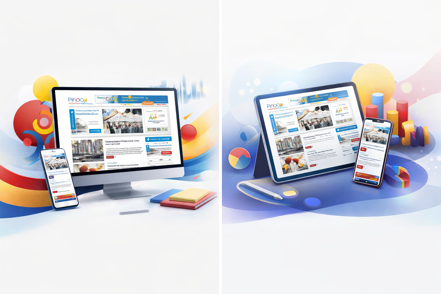
A UI/UX and development case study showing how a full rebrand improved engagement, clarity, and trust for a Filipino community platform in Dubai.
When I first encountered Pinoy In Dubai, the platform already had something powerful: a loyal audience. Filipinos across the UAE relied on it daily for news, jobs, and community updates. But despite its strong content, the experience felt fragmented. Navigation was unclear, visual identity was inconsistent, and users often struggled to find what mattered most.
As a freelance web designer and developer, I saw not just a website—but a community that deserved a clearer voice.
The Challenge
The platform faced a classic growth problem:
- Content volume had expanded, but structure had not
- Branding lacked consistency across touchpoints
- Users were spending time searching instead of engaging
- Advertisers had limited visibility due to poor content hierarchy
This wasn’t just a design issue—it was a business problem affecting retention, trust, and monetization.
The Approach
I led a full rebrand and redesign, aligning UI/UX decisions with business goals and user behavior. The process was grounded in practical research and real user flows.
Key actions included:
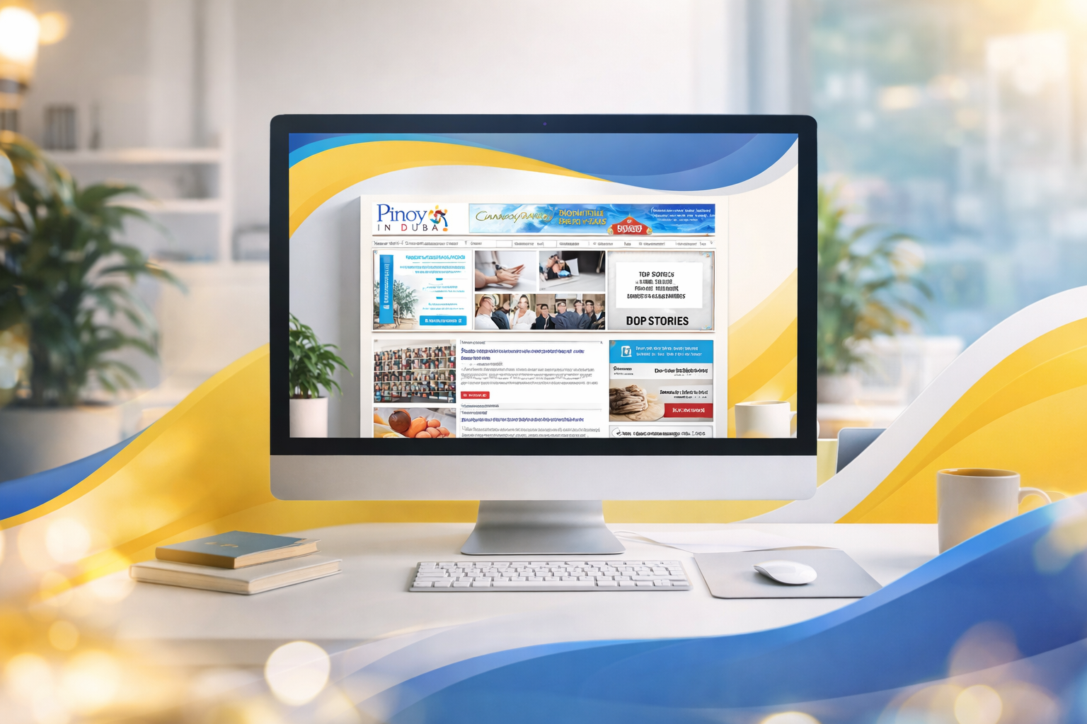
- Brand Identity Refresh
- A modern, cohesive logo and visual system to reflect credibility and energy
- Information Architecture Redesign
- Simplified navigation with clearly defined categories (news, jobs, lifestyle, classifieds)
User-Centered Interface Design
Clean layouts, improved readability, and mobile-first responsiveness
Development Optimization
Faster load times and scalable structure for future content growth
Content Discovery Enhancements
Featured sections, clearer calls-to-action, and intuitive browsing paths
The Transformation
The impact was immediate and measurable. Users began interacting with the platform differently—not just consuming content, but exploring it.
- Increased session duration and page views
- Higher engagement across key sections like jobs and guides
- Improved ad visibility and click-through rates
- Reduced bounce rates due to clearer navigation
By simplifying the experience, we didn’t just improve usability—we rebuilt trust.
The Outcome
The new platform reflected what the community already was: vibrant, resourceful, and connected. Users could now move seamlessly between content, discover opportunities faster, and feel more confident in the platform.
From a business perspective, the redesign strengthened brand perception and unlocked better engagement metrics, directly supporting growth and advertiser value.
My Role
As a freelance web designer and developer, I was responsible for:
- Rebranding (logo and visual identity)
- UI/UX design strategy and execution
- Full website design and front-end development
- Structuring content for clarity and scalability