A storytelling-driven UI/UX case study on redesigning Invespy’s homepage and investor dashboard to improve engagement, trust, and decision-making in property investment.
Overview
As a part-time product designer for Invespy, I was brought in to reimagine the company’s digital front door and conceptualize a smarter investment dashboard experience. The objective was not cosmetic. The mandate was business-first: increase investor confidence, improve engagement, and create a scalable foundation for product growth.
My Role
I worked as a part-time product designer, leading homepage redesign strategy and developing a new property investment agent dashboard concept. My focus spanned UX architecture, UI systems, feature definition, and ready-to-integrate design components.

The Business Problem
Invespy operates in a high-trust, data-heavy market: property investment. The existing experience presented strong information but lacked clarity, hierarchy, and emotional resonance. Investors needed:
- Faster pricing comparisons
- Clearer understanding of city and community insights
- Confidence in financial data presentation
- A seamless way to discover events and opportunities
- A modern interface aligned with premium investment services
From a growth perspective, friction in navigation and dense information architecture limited engagement and slowed decision-making.
The Strategic Approach
Rather than layering visuals over the existing structure, I reframed the homepage as a guided investment journey.
Clarity in financial interfaces directly translates into user confidence and faster investment decisions.
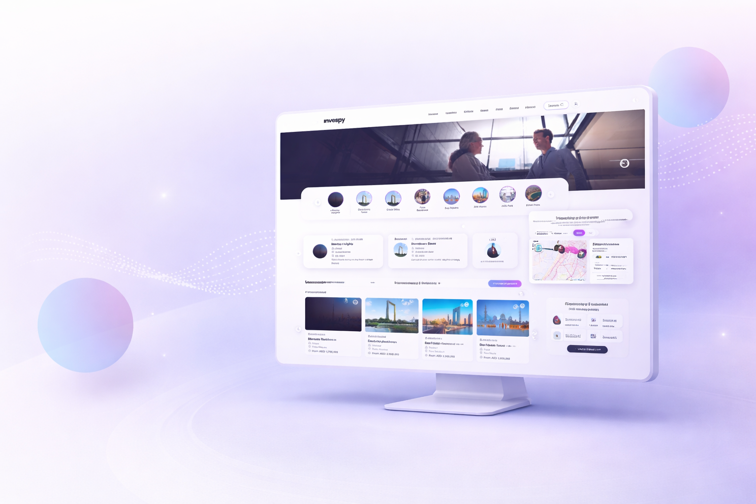
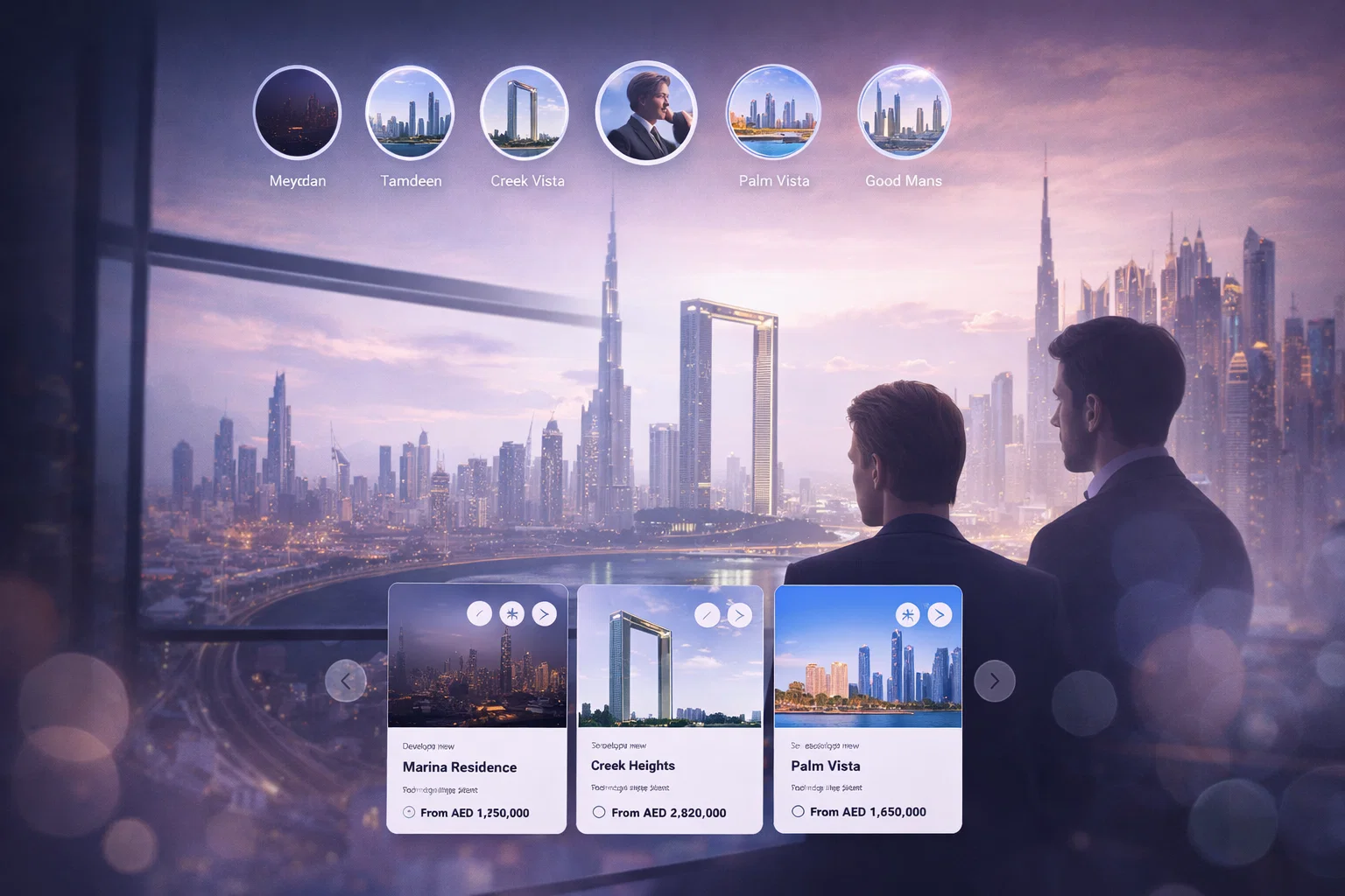
Homepage Redesign
The new homepage prioritized:
- Clear value proposition above the fold
- Simplified, sticky top navigation for persistent access
- Structured city and community discovery modules
- Data visualization blocks that translate metrics into insights
- Strong visual hierarchy to guide investors through pricing comparisons
By modularizing components, the design reduced development complexity while enabling future scalability.
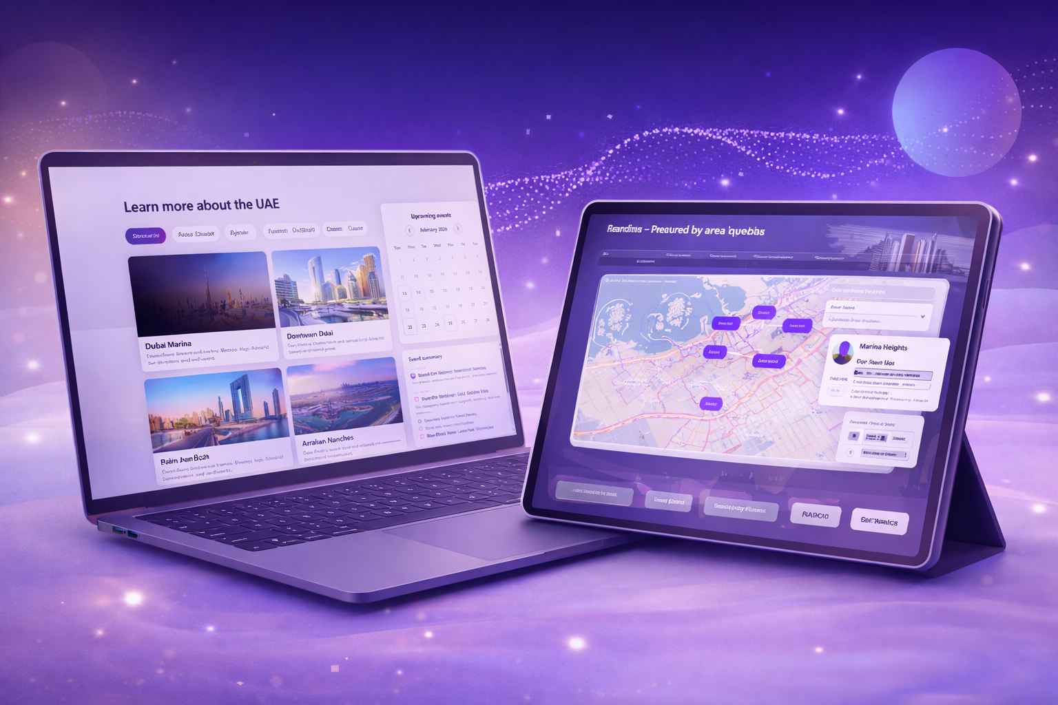
Investor Dashboard Concept
The dashboard concept focused on transforming raw data into actionable intelligence:
- Side-by-side pricing comparisons
- Visualized ROI indicators
- Clear property performance metrics
- Streamlined filtering for faster evaluation
- Consistent component library for rapid engineering implementation
Investment platforms succeed when complex data feels intuitive rather than overwhelming.
Measurable Business Impact
The redesign delivered tangible improvements across both user experience and business outcomes:
- Improved overall customer engagement through structured discovery
- Faster investor decision-making due to clearer pricing comparisons
- Increased trust through transparent, digestible data presentation
- Stronger brand perception with a modern, high-quality interface
- Reduced development time using reusable, ready-to-integrate components
- Improved usability through simplified, sticky navigation
Outcome
The redesigned homepage and dashboard concept repositioned Invespy as a refined, data-intelligent investment platform. By aligning UX strategy with business goals, the product experience evolved from information-heavy to insight-driven.
The result was not just a visual upgrade. It was a structural shift toward clarity, trust, and scalable growth in a competitive property investment market.